The Witching Hour #9 July 1970
A worried man dressed in traditional Chinese clothing runs through an archway upon which is seated an ugly hag-like witch. In the distance another man seems to be following him carrying a broomstick. Look closely and you can see that the man in the foreground is carrying a single straw.
Follow @top_notch_toshNeal Adams' cover for DC's Horror Anthology THE WITCHING HOUR #9 uses a few artistic techniques to good effect. Firstly the low angle from which the image is seen has the dual effect of making the running man tower over the reader dramatically as well as shortening the visual distance between his head and the crouching witch, helping to reinforce the threat to him. secondly the tilted angle allows him to cheat elements of the perspective to help give the whole picture a dynamic punch. Thirdly the Chinese lantern casts a vibrant glow, backlighting the central figure, and by contrast emphasising the sick, unearthly green glow of the witch.
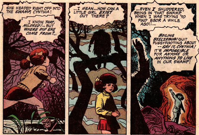
Without wishing to be unkind to the other creators in this issue, the cover is easily the best thing about THE WITCHING HOUR #9. Alex Toth's cartoony artwork runs it a close second, being so vibrant that it has the effect of dulling the impact of the more sober artwork manifest in the other stories. Toth's depiction of the three witches curating the comic is sensational and challenging, his style exciting to the point of mania.
But the framing story seems to be building to something which it never really gets to, the inclusion of the detail of the little girl out in the swamp, once introduced is then promptly forgotten about making the whole thing somewhat baffling.
The stories overall tend to be a bit ho-hum. Even when they start promisingly, the twist endings in a couple of them seem 'tagged-on' and disappointing. The first of these, THE LONELY ROAD HOME! benefits from its artist Bob Brown's choice of interesting angles in a few consecutive frames, but the ending lacks logic completely.
Additionally, the final story TRUMPET PERILOUS has an ending so absurd and so disconnected to the rest of the story that it defies belief. Artists J. Winslow Mortimer and Jack Abel at least seem to be enjoying the journey to this preposterous conclusion and take some care over their depiction of the discovered Indian village.
The central story, THE LAST STRAW, benefits from an effective depiction of its characters and setting, courtesy of artist Jose Delbo, but lacks the pace necessary to keep the reader really interested.
Finally, the super-short THE DAY AFTER DOOMSDAY... seems to be a fumbled attempt at condemning warfare, a noble sentiment indeed, but lacking subtlety in the telling. Kudos however to artist Dan Spiegle who goes for an added ironic message by drawing the hands of the two dead soldiers in a way that suggests Michelangelo's painting of God's creation of Adam--
Of course the Three Witches, like Cain and Abel, were to reappear years later in other titles, which I shall be looking into more closely another time. Until then, here's another example of Toth's wondrous, crazy style--
Tweets by top_notch_tosh


Sounds like you're just becoming acquainted with the work of Alex Toth, Andrew! You have a lot of great comic book art to look forward to.
ReplyDeleteYes, I'd heard the name, but had never seen anything of his previously. Absolutely loved his style here!
ReplyDeleteSeeing as how you're a fan of the old-time horror anthologies, I heartily recommend this collection: https://www.darkhorse.com/Books/25-034/Creepy-Presents-Alex-Toth-HC
DeleteThanks for the recommendation. Yes, I've been meaning to get my clutches on some of the old Creepy (and Eerie ) stuff!
Delete