Dec 14th Advent Calendar
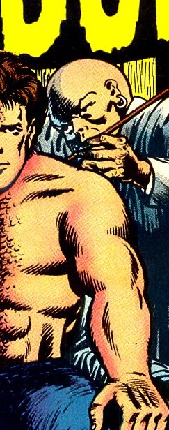
We start with a pair of feet. If they can truly be called a pair. For while one is clearly human, the other belongs to some kind of scarlet-skinned reptilian monster--
The rest of the picture's subject looks completely human all right--
Or should that be all left? I mean this is what he looks like all of his right--
Today's cover in this Advent calendar series is from Marvel's TOWER OF SHADOWS #5 dated May 1970, illustrated by Marie Severin and Bill Everett. We're presented with the striking image of what appears to be half-man, half-monster being attended to by a bald-headed guy in a white coat. This must be some kind of FRANKENSTEIN story about a mad scientist who has produced this sinister looking hybrid. But look more closely and you'll see clues that the truth is altogether more prosaic. The bald guy's pockets don't contain scalpels but brushes and behind the pair there's a dressing room mirror. And what about the caption alongside the figures-- I CREATED... THE DEMON THAT STALKS HOLLYWOOD!
Yes, this is no misfit of science, but a movie studio make-up artist and an actor. The story the cover illustrates, THE DEMON THAT DEVOURED HOLLYWOOD! is introduced by its artist, Barry Smith, a few months before the debut issue of CONAN THE BARBARIAN.
At one point in the story the make-up artist has indeed applied the ghoulish melange to just one side of Jason Roland's face, and the notion of doing it this way becomes kind of a plot point later. It seems to have been a sufficient excuse to inspire the cover art, which I guess can be forgiven for its suggestion that it's indicative of a slightly different theme to what the story is actually about.
Of course the idea of a face and even a body split down the middle in this way is hardly new. I won't be the only person seeing it whose first thought was of one of DC's most enduring villains. Since I first came across the character in 1990 in the BATMAN ANNUAL #14, this Neal Adams version of Two-Face has always been for me the most iconic image of the character. Adams even changes the background space behind each side of this portrait, a small touch but it really adds to the impact--
In the early 90s Marvel's SLEEPWALKER underwent a transformation rendering him HALF-MAN HALF-MONSTER as shown on this cover for #20. I will admit to not having ever seen or heard of this character or title previously. Artists are Kelly Krantz and Harry Candelario, again creators I'm afraid I have no knowledge of. I'd be happy for anyone reading this to fill me in--
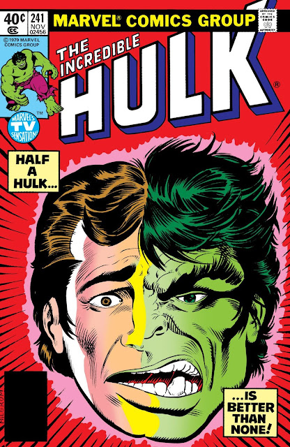
Here's a Marvel character I do recognise of course, this cover from HULK #241 representing a narrative in which Bruce Banner is trapped mid-transformation into his green alter-ego. Unlike Harvey Dent, Banner's dual personality involves him metamorphosing into a completely different entity much like Jekyll becoming Hyde. This cover knowingly references Two-Face, one of the Distinguished Competition's most easily identified characters, to emphasise the twist in this story that, like Dent, Banner is rendered neither one thing nor the other- a potentially more complex split personality.
And here's an example from CAPTAIN AMERICA 298 depicting the face usually hidden beneath the mask of the Red Skull. Again the obvious association with Two-Face cannot be denied. The spin here is that both faces look as mean and degenerate as each other. The angry mask merely hides another angry face. It's an utterly compelling image drawn by the ever-reliable Paul Neary, bold and uncompromising in its level of intensity. You start feeling your shoulders tense just looking at it. You can hear it screaming out at you. I'm guessing Neary had to have a lie down after completing this one.
This is a much calmer image, Jack Sparling's cover for HOUSE OF MYSTERY #173, representing the duality in all of us-- the potential to do good or evil. It's a popular theme used in films, picture postcards, even song lyrics- the idea of the haloed angel on one side, the horned devil on the other, each pulling at our waking thoughts trying to achieve dominance and act under their influence. Unlike Neary's furious rendition, Sparling's red-tinted devil is drawn with comfortable, well-meaning strokes, so that we can't really believe him to threaten too much in the way of menace. I'm sorry but although I really like this image I don't think it creates the desired effect with any great degree of success--
In much the same way as Sparling's picture, the following poster for ME, MYSELF & IRENE depicts two possible personalities at play in Jim Carrey's character, and again the face is divided by a split much like the tear down the centre of the comic book cover face. The problem with this one is that Carrey doesn't exactly look 'gentle' in the left-hand image, just a different type of 'mental'--
And film-makers, just like comic creators, love playing with the idea of a split personality. The poster for MELINDA AND MELINDA also uses the concept of the split face, this time to suggest two slightly different tellings of the same story, one up-beat the other down-beat--
Director Woody Allen must have known, however, that the poster above would summon up in the viewer's mind the sense of a split personality, especially since one of his favourite directors, Ingmar Bergman had included a renowned split-screen shot of actresses Bibi Andersson's and Liv Ullman's faces joined together in his 1966 film PERSONA--
And while the Bergman example is a million miles away in execution and impact from the examples from TOWER OF SHADOWS or CAPTAIN AMERICA or BATMAN, the underlying intent is always the same-- to show that we all have the capacity to be more than one thing-- that we can choose to be an angel or a devil, a human or a monster, an optimist or a pessimist, ourselves or somebody else. Well, maybe not the CAPTAIN AMERICA cover... I can still hear that guy shouting in my face. I don't think he gets to choose. He's going to be angry whether he's wearing that mask or not.
For day 13 of this Advent Calendar click here--
Tweets by top_notch_tosh


Comments
Post a Comment