Dec 16th 2020 Advent Calendar
Even through his mask, Spider-man's emotions are clear-- sadness, disappointment, concern--
His friends look on aghast at what they are seeing and hearing-- surely it's a joke?
No-- Peter Parker has confessed all to them-- producing the mask to prove what he's saying is true he reveals he is Spider-man--
Today's cover for this Advent Calendar series is John Romita's lovely image for THE AMAZING SPIDER-MAN #87, dated Aug 1987. 'If you only read ONE mag this month--- It must be this one!' declares the caption, not for the first or last time an example of a comic hyping itself up to a point that the contents themselves are rarely likely to reach. Because despite the fact that Spidey is 'Unmasked at last!', the status quo is naturally restored by the end. Besides which, the story even references an early issue in which the web-slinger was previously unmasked by Doc Ock.
What strikes me most about this cover is how still and quiet it is. Especially when contrasted with the other SPIDER-MAN comics produced in the same year. Without exception they are graced with action covers, our hero depicted in a range of challenging and perilous situations.
This cover for #87 suggestions a very different type of story than usual, and indeed that's what it delivers. There is no external conflict for Spider-man to combat- no bad guys trying to defeat him or disasters for him to avert. Instead the issue is a charming chamber-piece in which Peter Parker finds his powers dwindling and elects to retire his alter-ego.
Romita presents the towering figure of Spider-man symbolically holding his 'family' of friends protectively within his arms. At their centre stands the morose looking Parker, mask in hand, as he reluctantly confesses his secret to them. The outstretched arms with the palms exposed suggests other iconographic representations of strong, protective subjects--
And it isn't the only time a comic character has been portrayed like this either, as this cover from the final issue of ROM demonstrates--
Of course the hero unmasked idea is a common enough stand-by story for writers, and interestingly when it was Superman's turn in 2011, John Cassaday chose to emulate the SPIDER-MAN cover by depicting the Kryptonian characters in a very similar way-- the Superman persona, like Spider-man, is depicted as a huge observing spectral figure while his Clark Kent persona is surrounded by members of his confused superhero family. The fists placed firmly on the waist give the spectral Superman a real air of disappointment and indignity at being abandoned by Kent.
And when, just a few years previously, Marvel had published SPIDER-MAN NO MORE! in #50, this was the cover Romita and Esposito produced. While this time Parker is depicted alone and the shape of his costumed self appears to be turning away from him, the principal similarity between this and the cover for #87 is the towering figure being used in an abstract way to create a composite picture, a symbolic representation rather than a naturalistic one.
The composite picture has been a standard way of promoting movies for many decades, often depicting many different characters and moments from a film or a central image which conjures up several themes or elements. And sometimes the device of a figure symbolically towering over everything, such as the movie's all-powerful villain, adds the final touch, throwing everything else into relief--
In comics the composite image of an ominous figure looming over the rest of the picture has been used effectively a number of times. One of the earliest and most famous examples must be this Bob Kane illustration for DETECTIVE COMICS #31 back in Sept 1939, an image which has been recreated and parodied several times over the years. A purely naturalistic picture would miss Batman's seemingly omniscient presence and be a pretty dull cover altogether--
So often the effect of this particular design technique is to suggest the towering character's insights or judgements about what they appear to be observing, or otherwise their omnipotence, all of which usually gives them a god-like presence. Try to imagine this Joe Staton cover for GREEN LANTERN #151 with just Hal and Carol and an empty sky behind them. The placement of the Guardian's huge head, taking up half the height of the image, adds so much to the overall impact of the picture and says so much about his character and abilities.
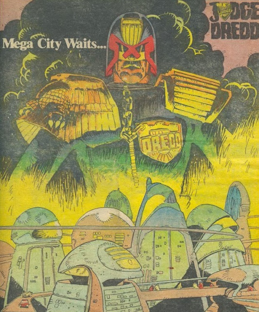
And this poster image of Judge Dredd towering over Meca-City One was published at the time that the lawman was on an extended mission off-planet. This beautiful portrait by my all-time favourite 2000AD artist, Mike McMahon is loaded with symbolism suggesting Dredd's varying roles as harsh Judge but also as compassionate protector of the city he seems to both love and hate at the same time.
As with the STAR WARS poster above, comics have also effectively been graced with some great covers in which the huge figures of the villains visually dominate. This Zeck/Beatty CAPTAIN AMERICA cover also boasts the idea of Cap and his robotic doppelganger being held in the hands of the all-powerful Red Skull--
And in the following cover it's the gigantic Galactus whose hands are reigning destruction down on the retreating FANTASTIC FOUR. This Kirby/Sinnott cover from 1966 goes even further than the GREEN LANTERN cover above in that the figure of Galactus takes up easily three-quarters of the page height, leaving the FF looking especially puny and vulnerable, the closeness of his head to them being impossible to draw with the same impact if the picture had been rendered more naturalistically--
Curiously I was kind of familiar with Kirby's image before I even saw it, having read the novelisation of DOCTOR WHO - THE THREE DOCTORS as a child. Whether you would consider Chris Achilleos' painting of Omega to be an inspired homage to Kirby or just an opportunist swipe is really a matter of personal opinion. Either way it's an iconic image in itself for DW fans of a certain age.
IRON MAN #115, illustrated by Romita/Patterson in 1978, offers quite an interesting variation on the overall idea. Here Tony Stark is confounded in his attempt to transform into his metal-suited counterpart by a group of attacking creatures, the Ani-men. To suggest his frustration and also the latent strength of Iron Man, Romita adds the huge shape looming over the action, fists clenched. But the colours are bleached out to symbolise his impotence to intervene.
Finally, Steve Bissette's cover for SWAMP THING #52 features the spectacle of Swampie raging furiously, seemingly surrounded on all sides by the gigantic presence of Abby's tear-strewn face and cuffed hands. It's an effective way of demonstrating the mud-monster's inner thoughts, how greatly his new wife's imprisonment is affecting him. The fact that Bissette has drawn her completely enclosing his figure shows how close their relationship is, the cuffs especially emphasising how he feels imprisoned too, not just in sympathy with Abby, but by the hostility of those they encounter and of course within this plant body.
It's worth considering how many of the above images also, when you think about them, are suggestive of the fact that the huge spectres drawn above them are often representative of the smaller figure's thoughts, their fears, their desires, their consciences, their obsessions. I think it's certainly the case with a fair few of them, the SPIDER-MAN covers perhaps being the most obvious examples.
Tweets by top_notch_tosh


Comments
Post a Comment